NEON SIGN MUSEUM: 2021
PROJECT SCOPE
Flexible Branding
UX/UI Design
THE CHALLENGE
Update a museum’s branding to make
a more versatile visual identity
The Brief: Create a “kit of parts” for generating a visual brand/identity for The Neon Museum. Research flexible branding and think about how the concept could be applied to our museum. The goal is to design a system consisting of type, pattern, color, and image elements that is capable of generating an open-ended set of variations rather than a fixed solution.
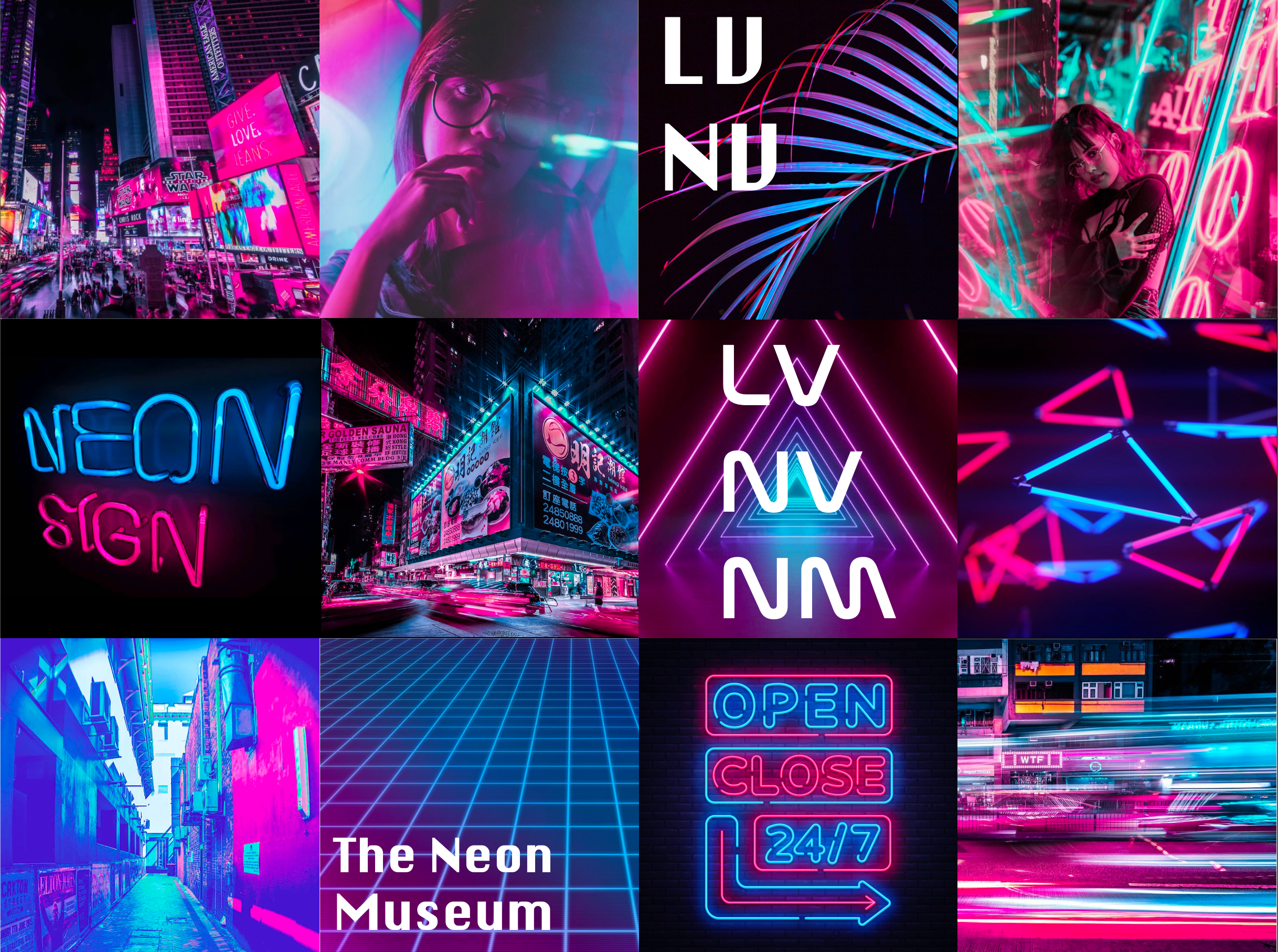
Brand Squares Option 1
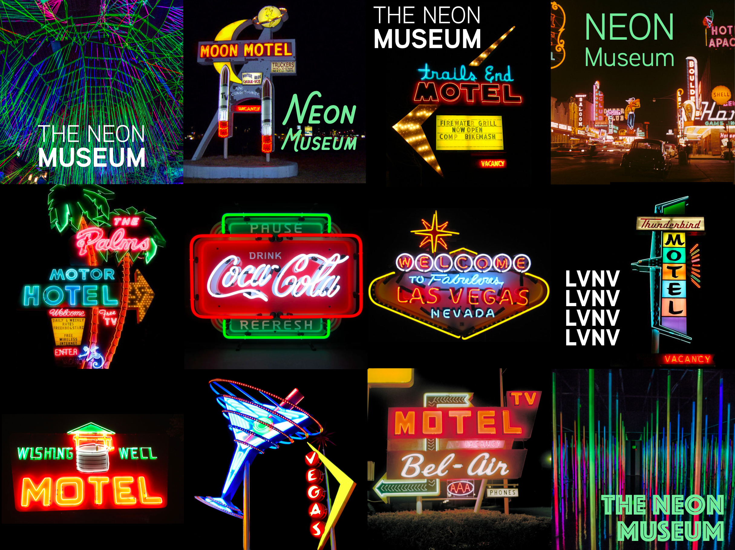
Brand Squares Option 2
These brand squares, while cohesive, were leaning too far into the hyperwave design aesthetic because of the color and image choices and would quickly become more outdated as that style went out of trend.
These squares were much closer to the decided on brand direction. The colors moving forward were pulled from these images, and the font choices were influenced heavily by these signs.
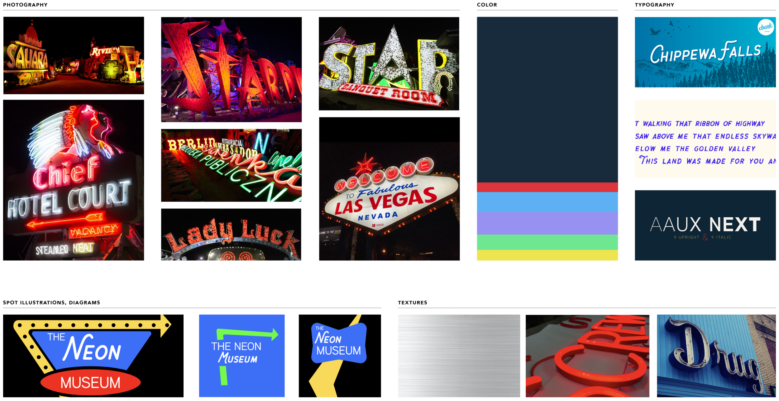
STYLEBOARD
Once I knew which elements from the brand squares I wanted to keep, I combined them into one styleboard to help influence my design decisions later.
NARROWING APPLICATIONS
Originally, I created very traditional looking tickets for the museum but not many people utilize paper tickets for a museum anymore as now you can purchase them online so I thought it would be more applicable to create the tickets as glowsticks which would be more practical as the museum is viewed at night and match the neon theme more accurately.
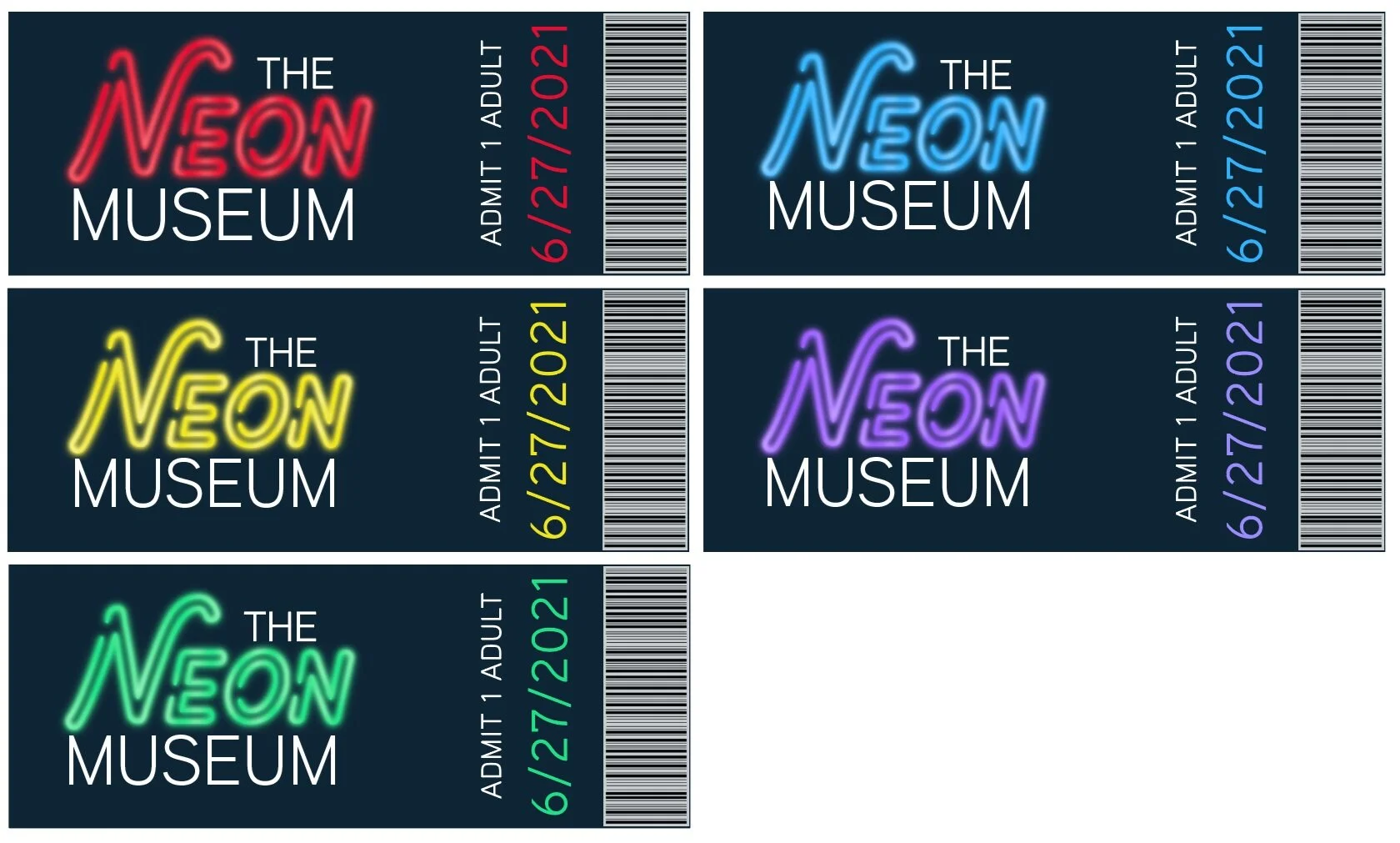
Original Ticket Concepts
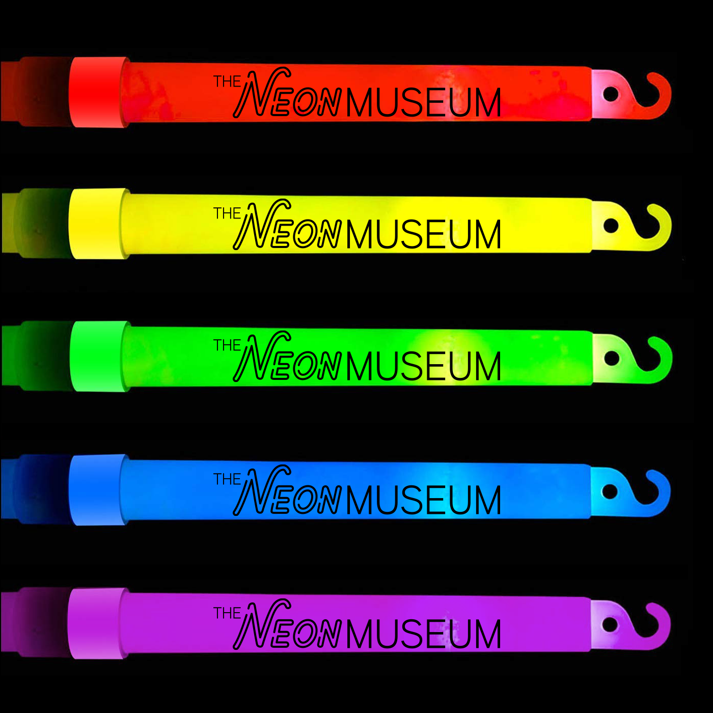
Final Tickets
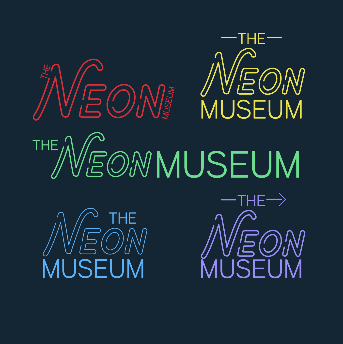
Original Logo Iterations
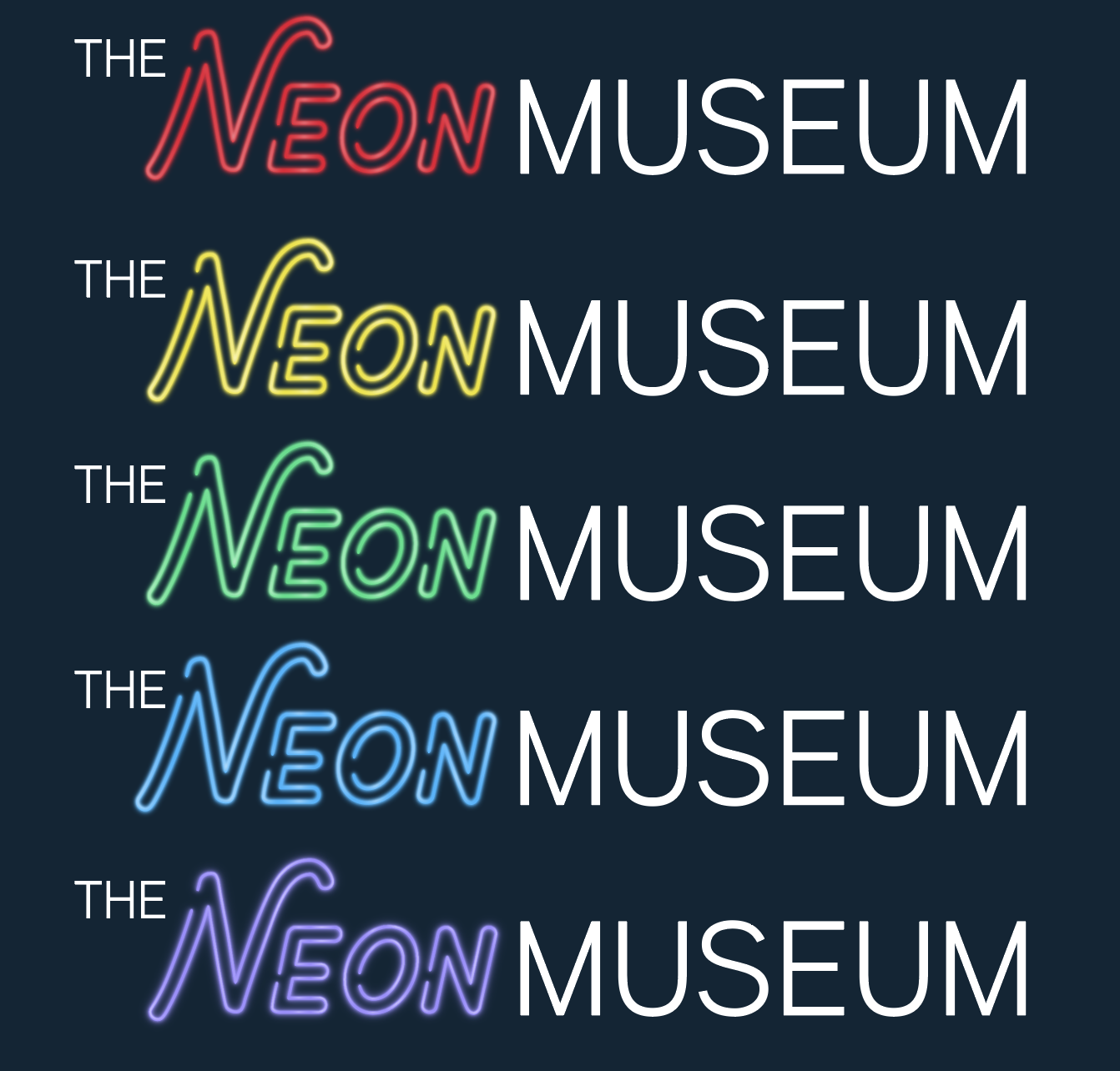
Horizontal Logos
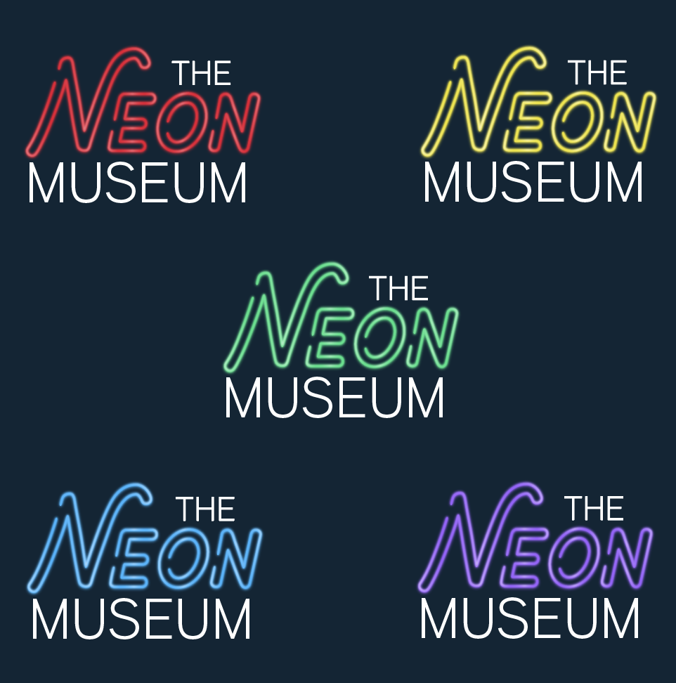
Vertical Logo Option 1
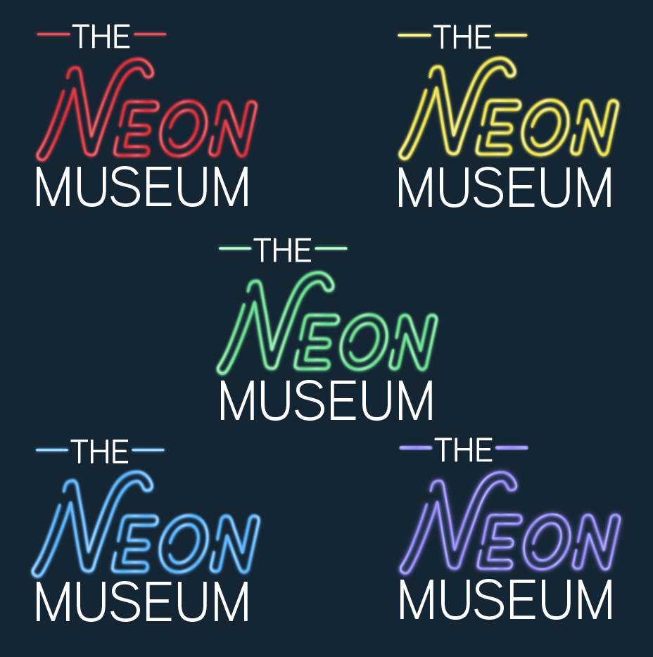
Vertical Logo Option 2
MUSEUM LOGO ITERATIONS
After making multiple iterations for the logo I felt it would help the brand be more flexible if a few were utilized so I chose three options, two to be used interchangeably and more vertically stacked and one for more horizontal applications.
INTERNAL PIECES - STAFF UNIFORMS AND SIGNAGE
Internally, I designed the staff uniform using the neon inspired font and treatment to help the staff match the ew image of the museum. I also created signage using the same style and had it stand off the wall so it would be more easily recognized by patrons.
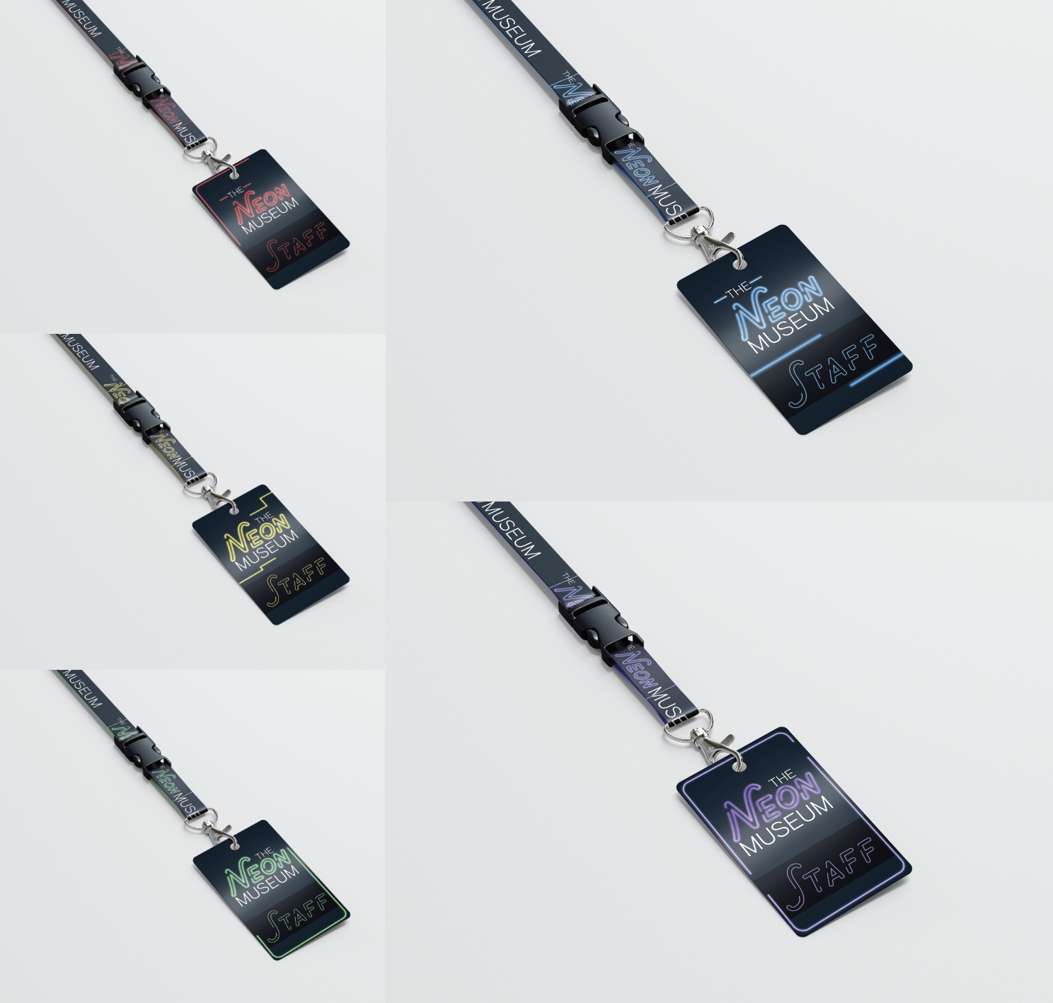
Staff Badges
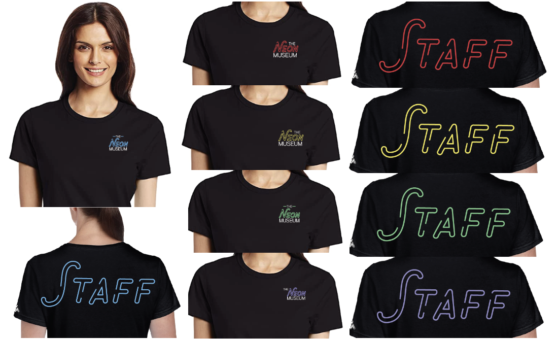
Staff Shirts
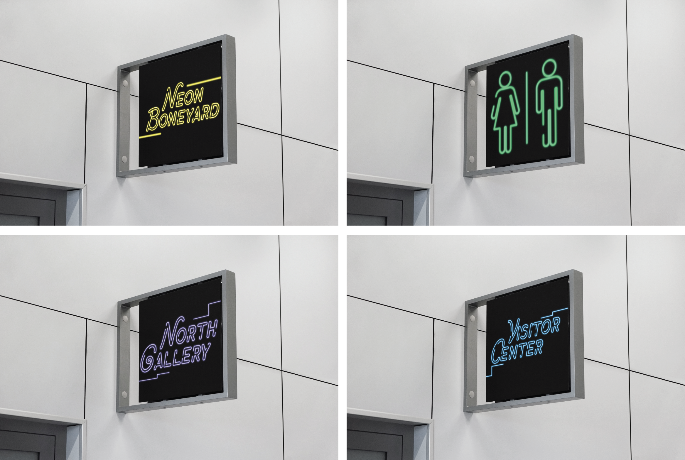
Internal Signage
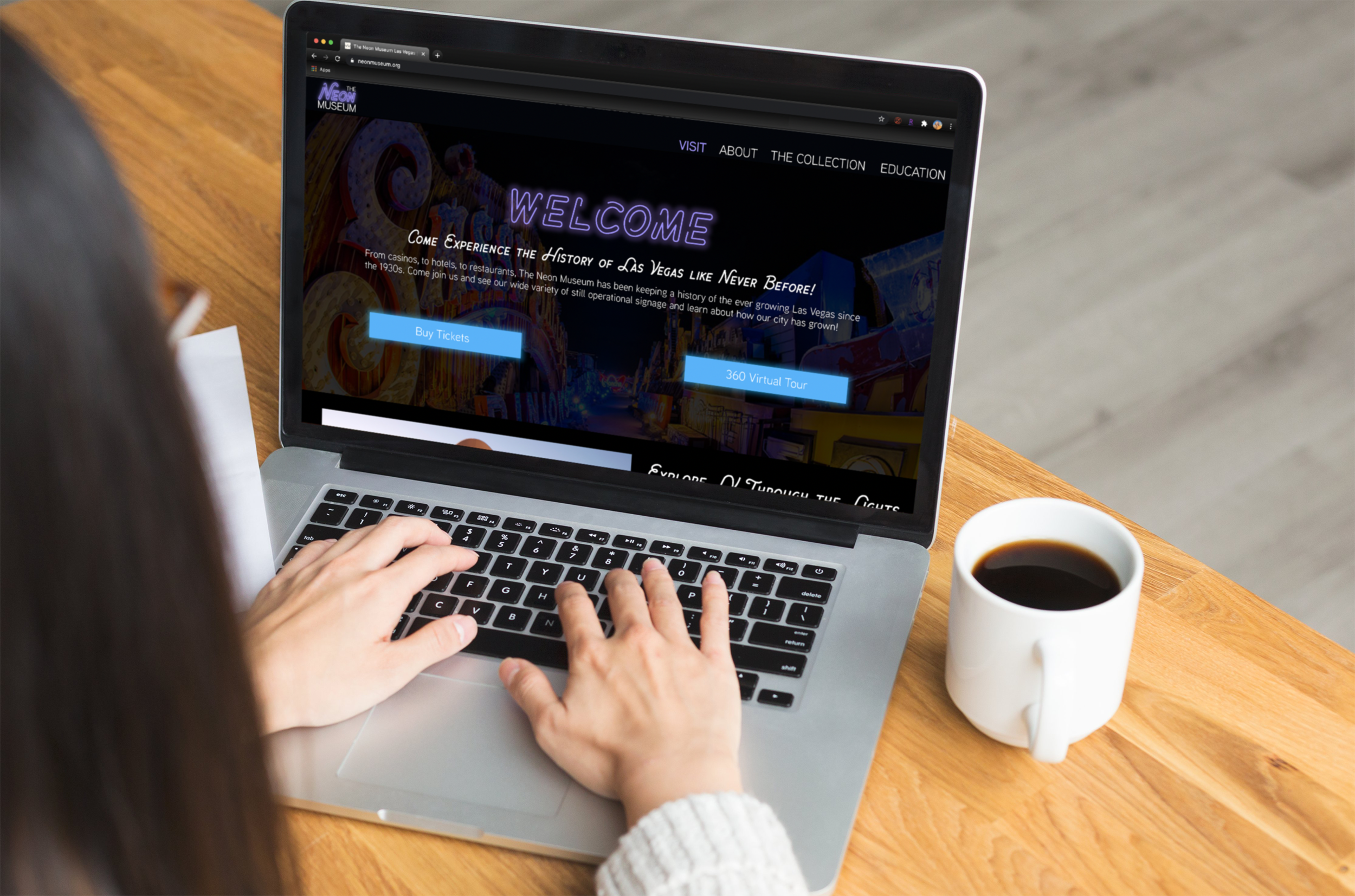
Website Mockup
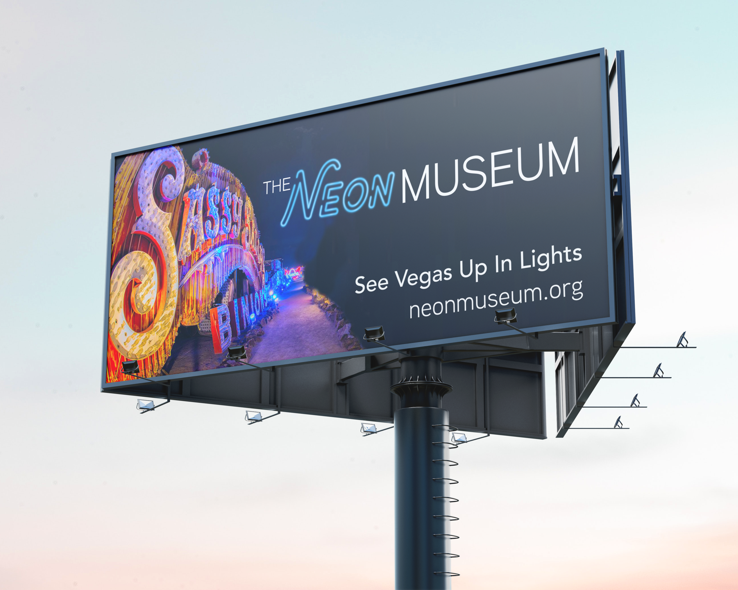
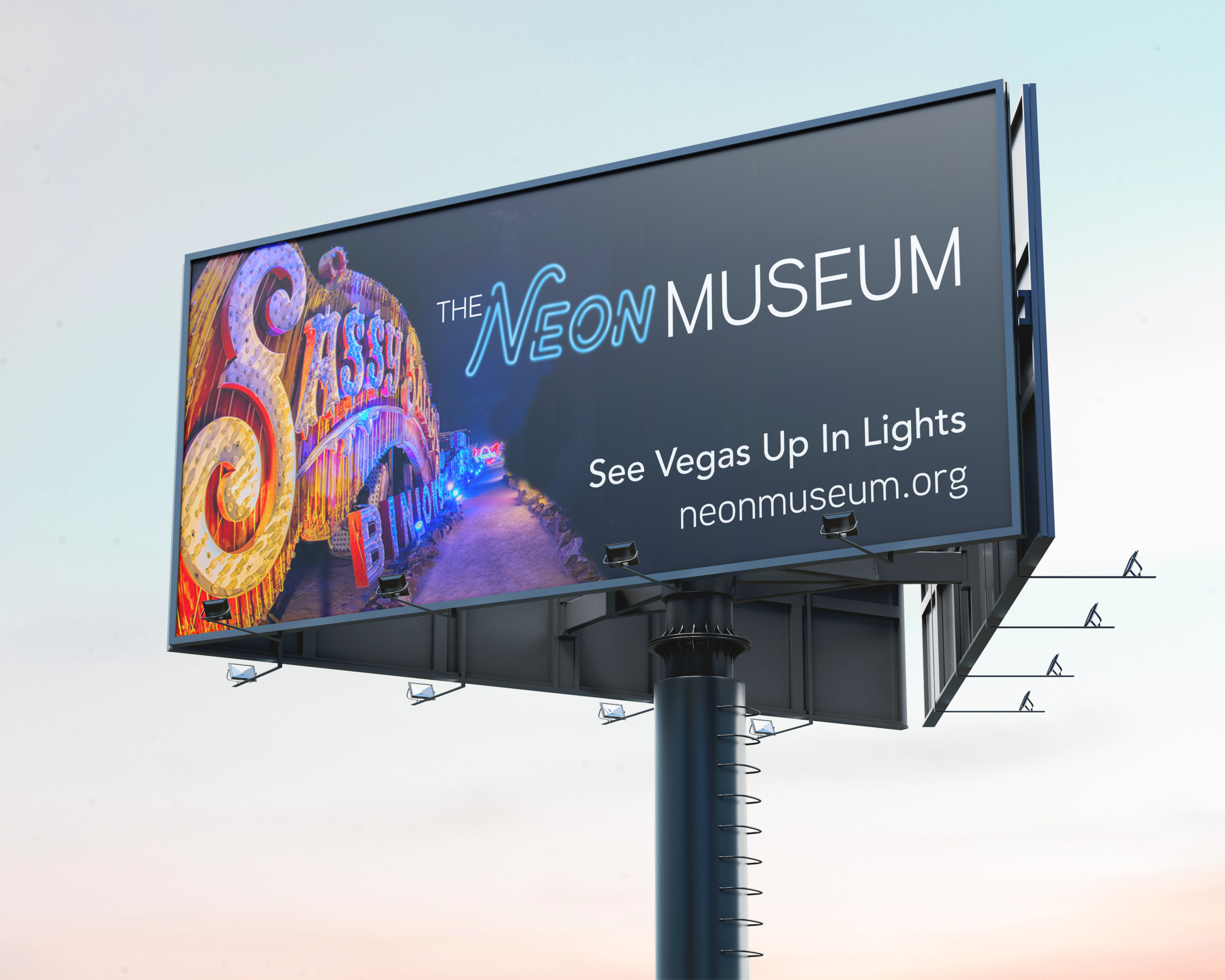
Billboard Mockup
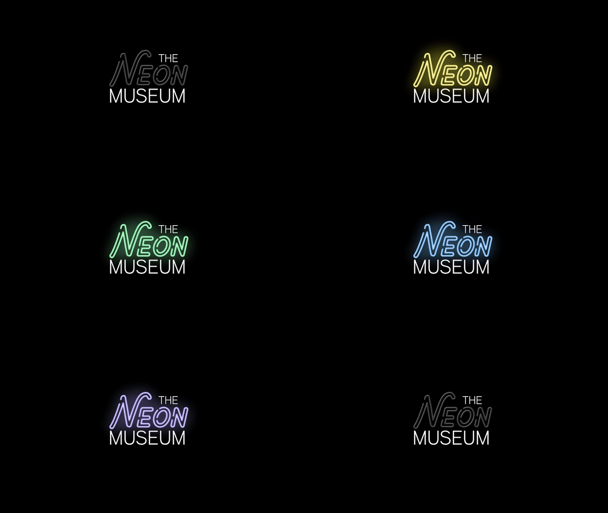
Neon Sign Animation
EXTERNAL PIECES - WEBSITE AND BILLBOARD
Because The Neon Museum is trying to compete with other attractions in Las Vegas, I also redesigned their external facing assets like their website. I also created billboard advertisements for them to increase their recognition among other possible attractions.
BRAND GUIDELINES