
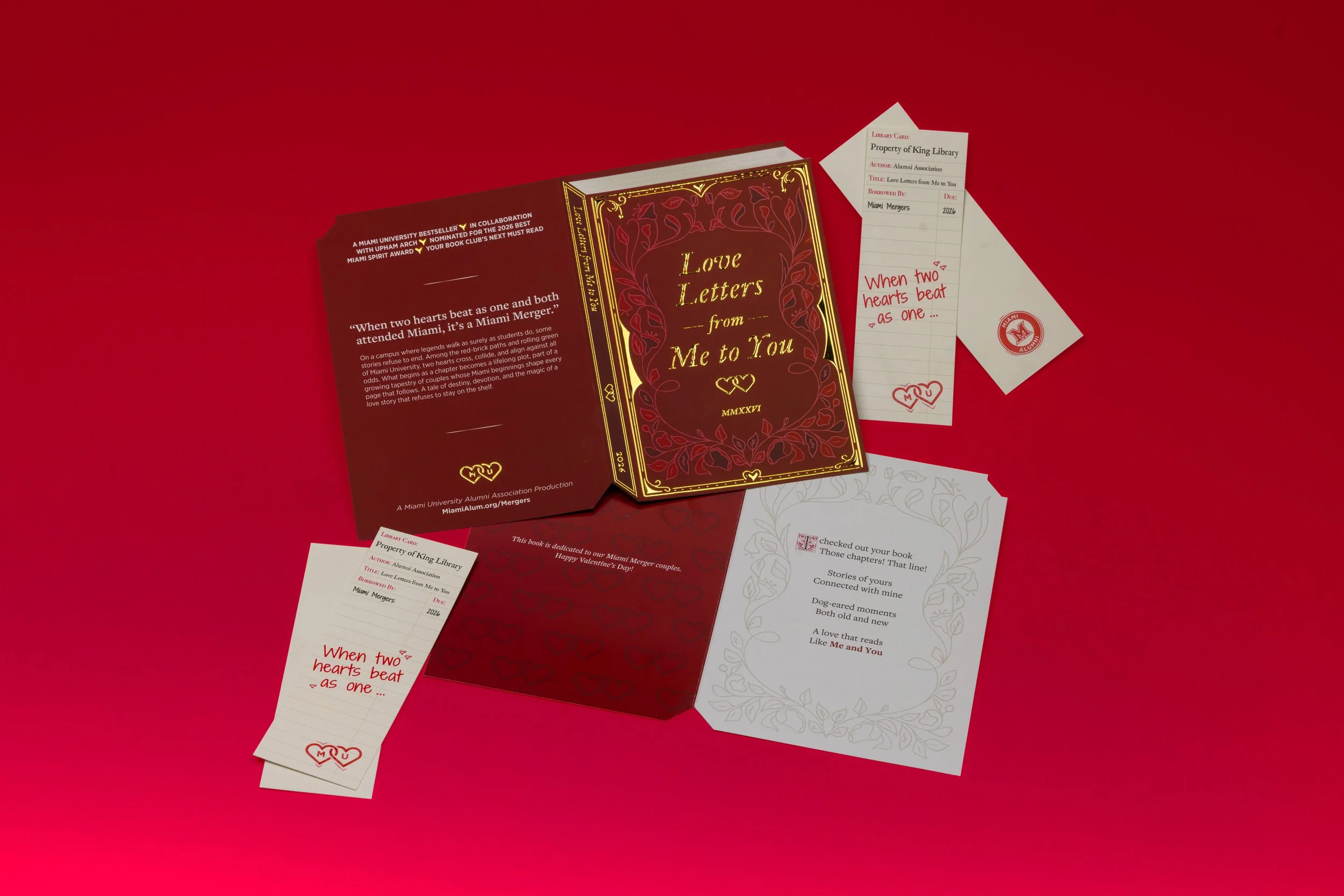
LOVE LETTERS FROM ME TO YOU - MERGER VALENTINE
PROJECT SCOPE
Audience Engagement
Graphic Design
THE CHALLENGE
Create a Miami Merger Valentine that will resonate with a multi-generational audience and can be mailed flat.
The Brief: Every year, the alumni association mails a valentine to their “Miami Mergers,” which are two people who graduated from Miami and later married. It is one of their largest group of constituents, at over 28,000 alumni, or 14,000 couples. The strategic goal of this piece is to deepen their affinity for the university and continue their engagement with the university. As with the previous valentine, it was asked that this be able to mail flat.
THE CONCEPT
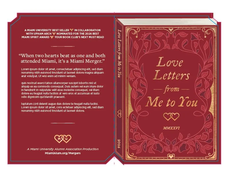
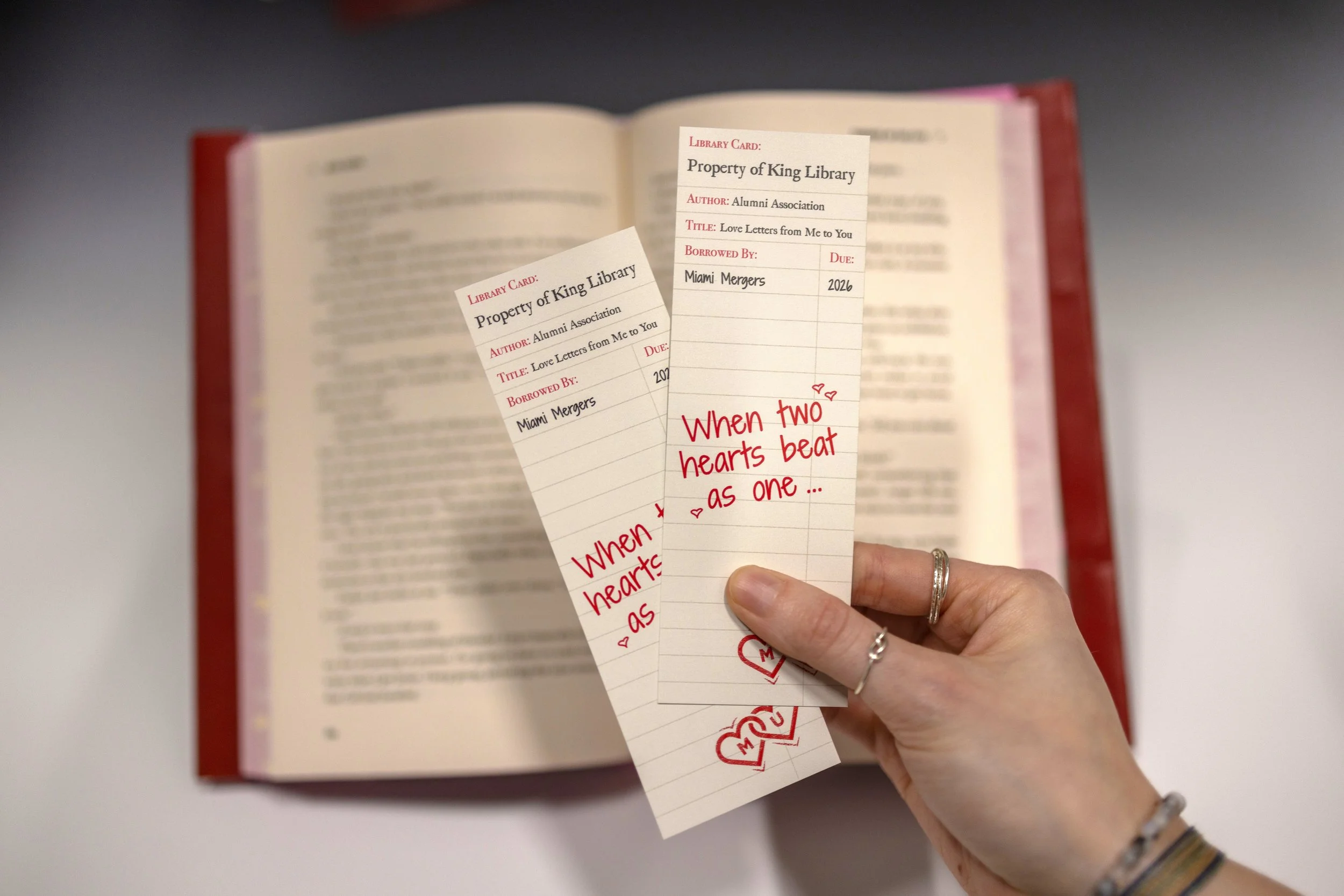
In recent years, there has been a large resurgence in the popularity of reading, in part because of the prevalence of BookTok. Because of that and the universality of the activity, I came up with the idea to create bookmarks as the Merger promo item. The concept of the design for the bookmarks came first, styling them to look like a library checkout card. This decision informed the layout of the card which was styled to look like an old book.
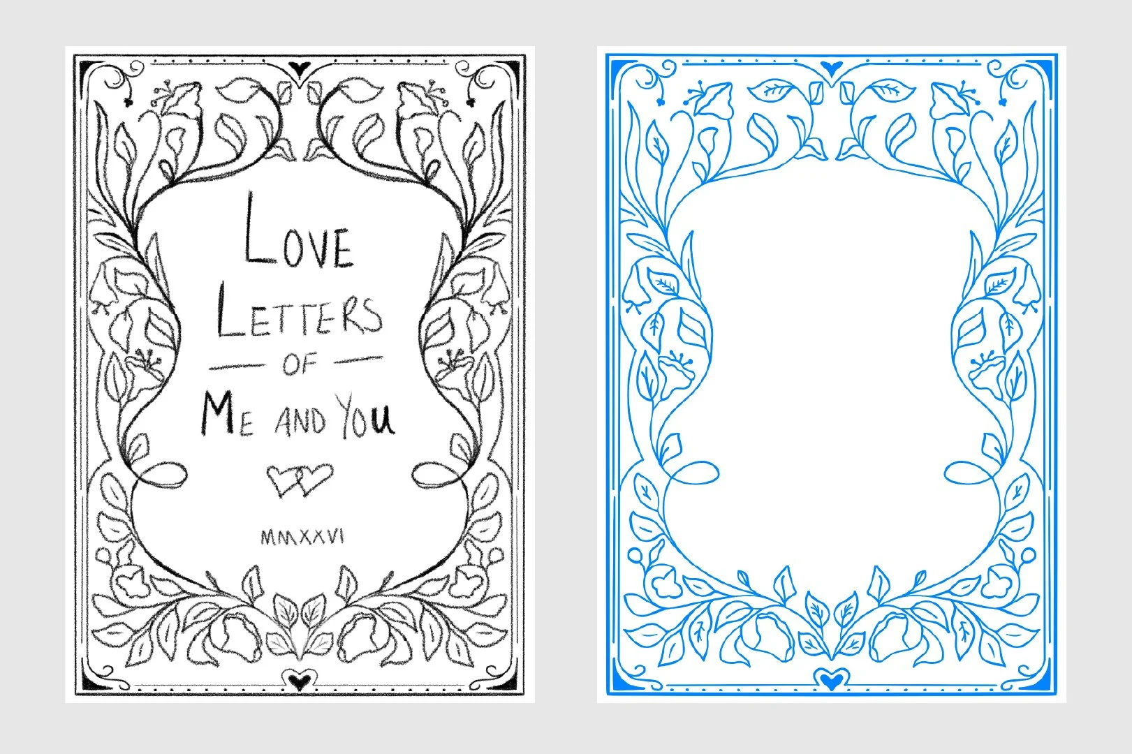
Cover Sketches
One major challenge that this valentine faces is the need to be general enough to apply to alumni across multiple spectrums. Because of this, I had to stay away from depictions of people, so I pulled inspiration from older leather bound books which lean more heavily on simpler line art. Nature and plants were a common motif in the cover designs, so I made sure to integrate that into my sketches.
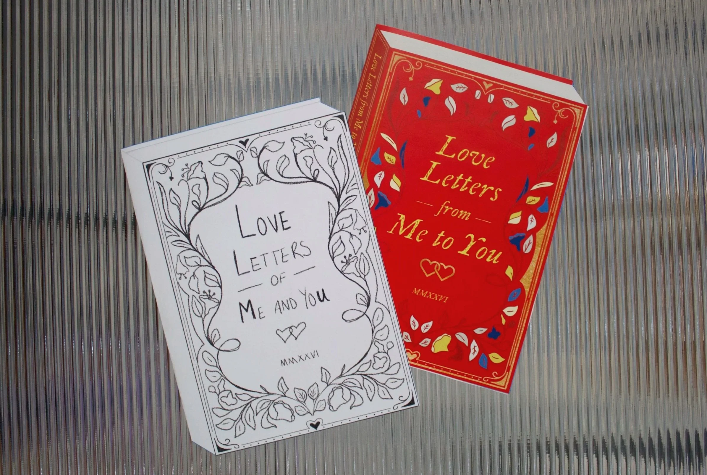
Prototyping
To play off of the library check out card concept of the bookmarks, I created a card in the shape of a book. I wanted it to go beyond just looking like a regular card, so I set it at an angle with a few die cuts to imply the pages and thickness. Once the die was created, I tested a few different sizes before transforming the sketch art into vector.
CARD DESIGN OPTIONS
With the line art done, the next major decision to be made was on the colorway of the cover. The valentine has more leeway on using colors outside of the Miami brand, so I experimented with a few different options. A major consideration was trying to balance the contrast of the design on the cover to make it visible but not too busy once the title was added. Below are three of the concepts trying out different palettes.
Option 1: Brand Colors
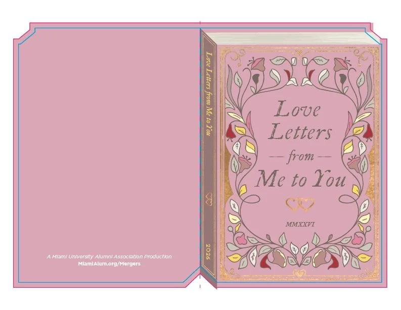
Option 2: Pink Neutrals
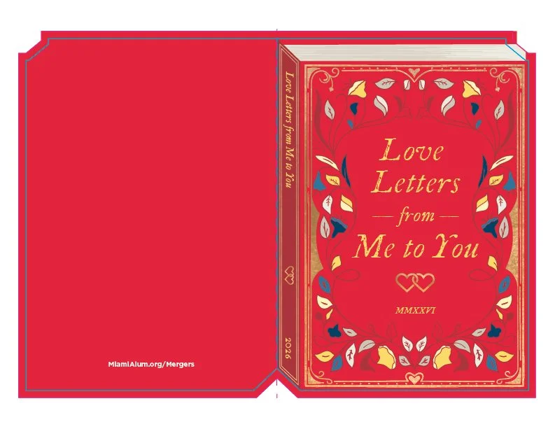
Option 3: Brand Color Adjacent
Trying to use the main brand colors took the design too far away from the desired look of an other, foiled book. The pink and neutral option felt too light to be able to have a high enough contrast with the foiling on the front, so I presented option 3 to the client.
BOOKMARK DESIGN OPTIONS
I created three different design options and multiple color palettes for the bookmarks that would be placed in the card. The first was handwriting forward, the second meant to mimic a typewriter, and the third was a combination of both.
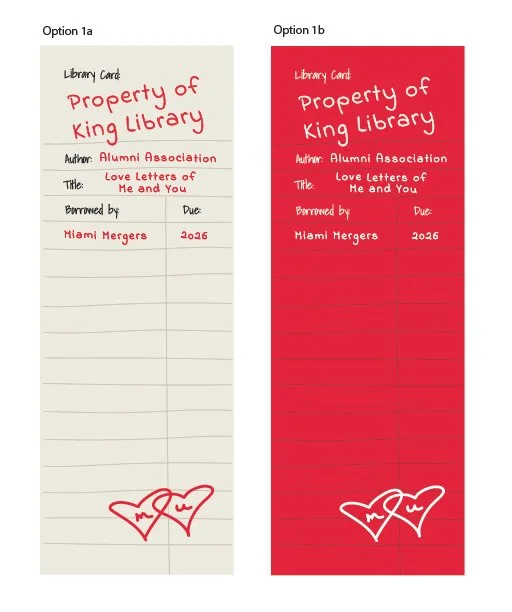
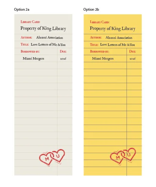
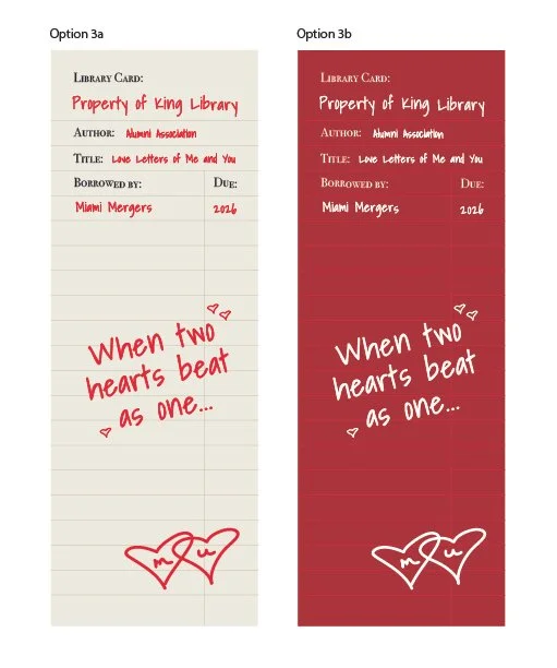
The client liked the clean fonts of option 2, but the use of the Miami Merger quote on option three, so the final bookmarks were a combination of those elements. The tan color palette was also chosen because it would look the most authentic. I made the merger logo on the bottom of the bookmark and the alumni association logo on the back look like a rubber stamp like those used when books were checked back in.
BUMPS IN THE ROAD
While working on this project, I encountered many challenges when working with our printer. Though samples and specs were sent to them throughout the process, multiple proofs were sent back with missing elements, incorrect colors, and without finishes. This process challenged me to commit to the details I wanted and fight for the finished product to turn out properly. It also taught me the importance of clear communication and teamwork both with my project managers and with the vendors creating the card.
FINAL PRODUCT

VIDEOS
Social Media Reveal
For the reveal video, we wanted to show the bookmarks in context. I created a book cover wrap that matched the card and we worked with a videographer to film us inserting the bookmark into the pages.
Valentine Unboxing
The final valentine was mailed as seen below in the unboxing video.