TOO FACED ICON SET: 2019
PROJECT SCOPE
Iconography
THE CHALLENGE
Create an icon set for a brand to utilize on their outward facing assets
The Brief: Design two sets of vector icons for the brand Too Faced. Each set should include 20 icons, designed with a cohesive visual style. The first set should be full-color, making use of an appropriate color palette. The second should be a one-color interpretation of the full-color set.
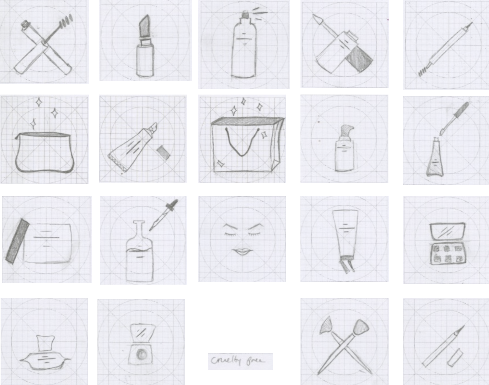
INTITIAL SKETCHES
This process began with sketching out 40 different options for images to be narrowed down to the 20 shown here to create one cohesive set.
FIRST DRAFTS
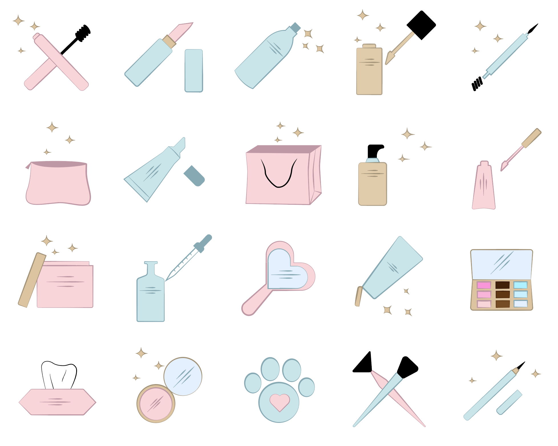
Included in the first drafts of these icons are some of the sparkle imagery Too Faced uses in their current branding, as well as the blue and pink brand colors. The back utilized in these was too harsh so that is removed in following iterations.
FINALIZED ICON SET
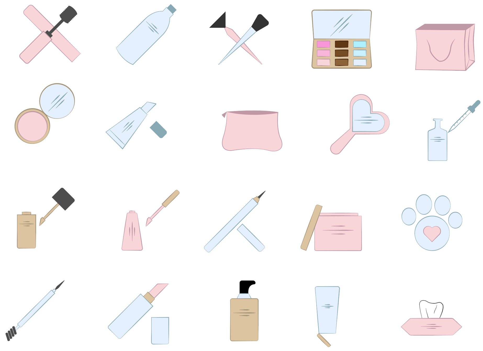
After taking into consideration the feedback received on the draft icons, I lightened the black to a gray tone to match the color story of the other icons more effectively. The sparkles were also removed as they felt a little out of place on some of the icons and if it were removed from the overall branding, the icons would no longer fit in.
SINGLE COLOR ICONS
After creating them in full color the next challenge was to make them single color and maintain their balance and legibility for the user.

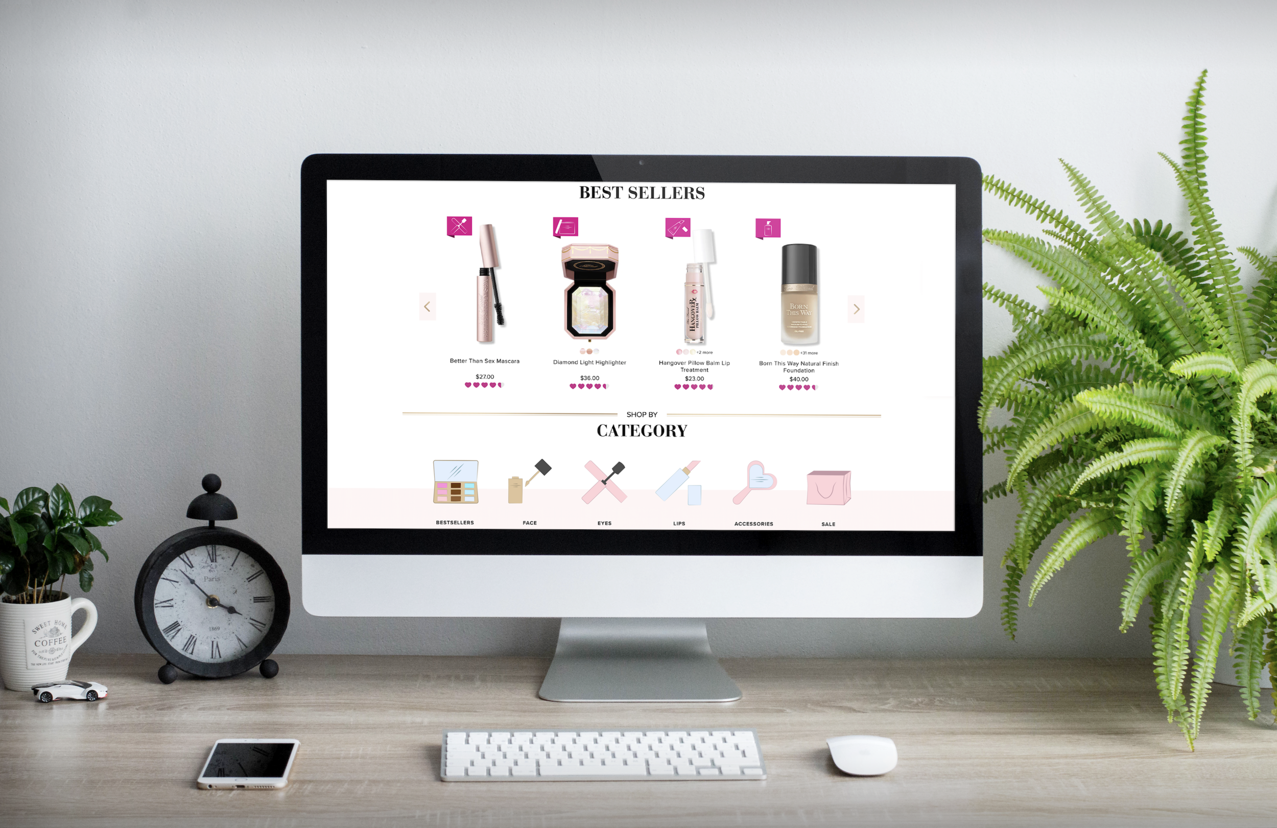
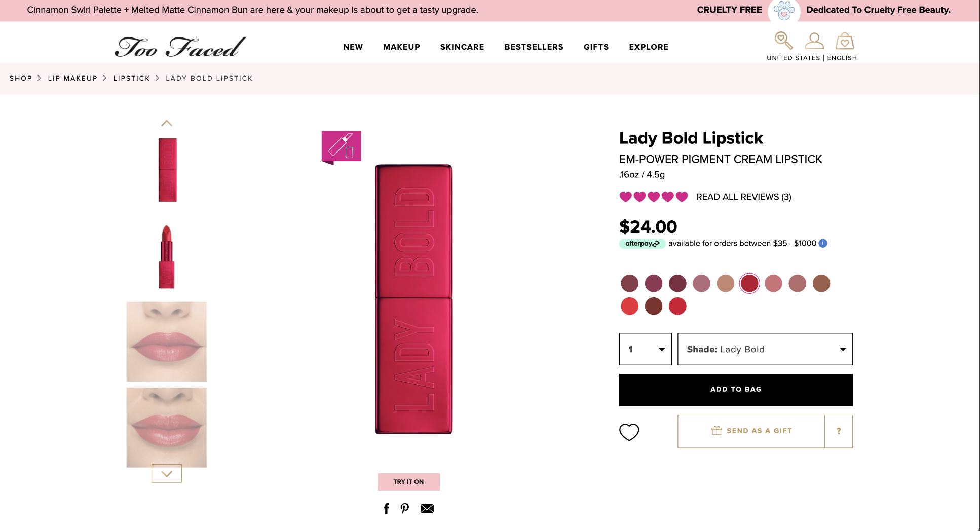
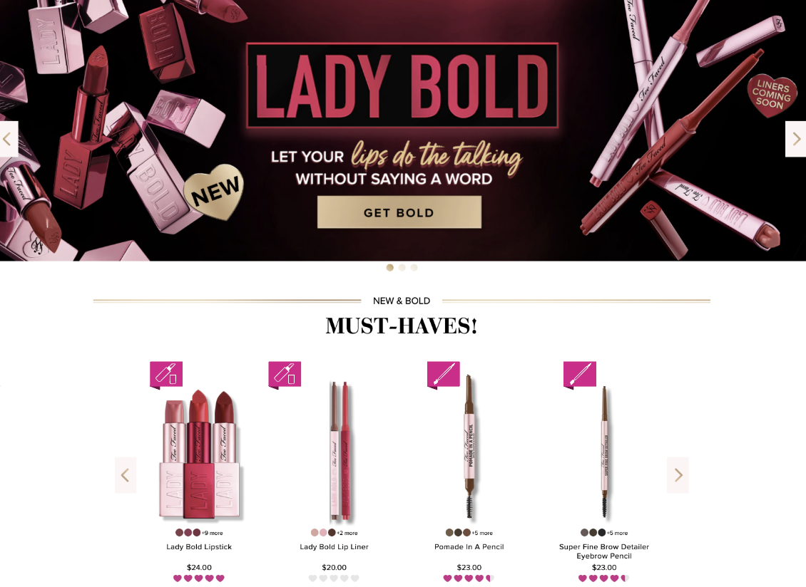
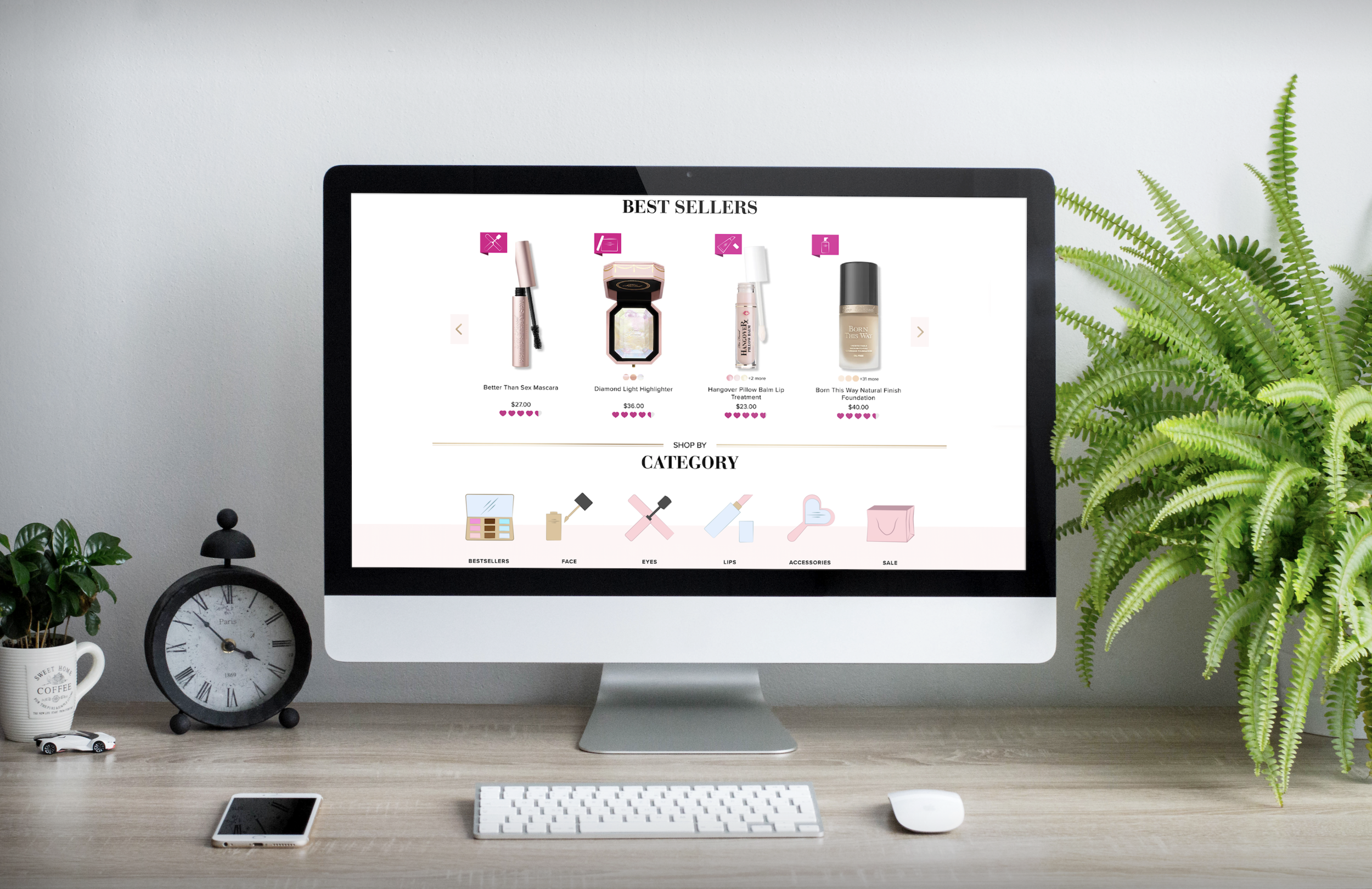
FINAL APPLICATIONS